 We all know that advertising companies use color to trigger emotions for increased sales. So, why not use the power of color to create a preferred emotion or mood for our outdoor living spaces?
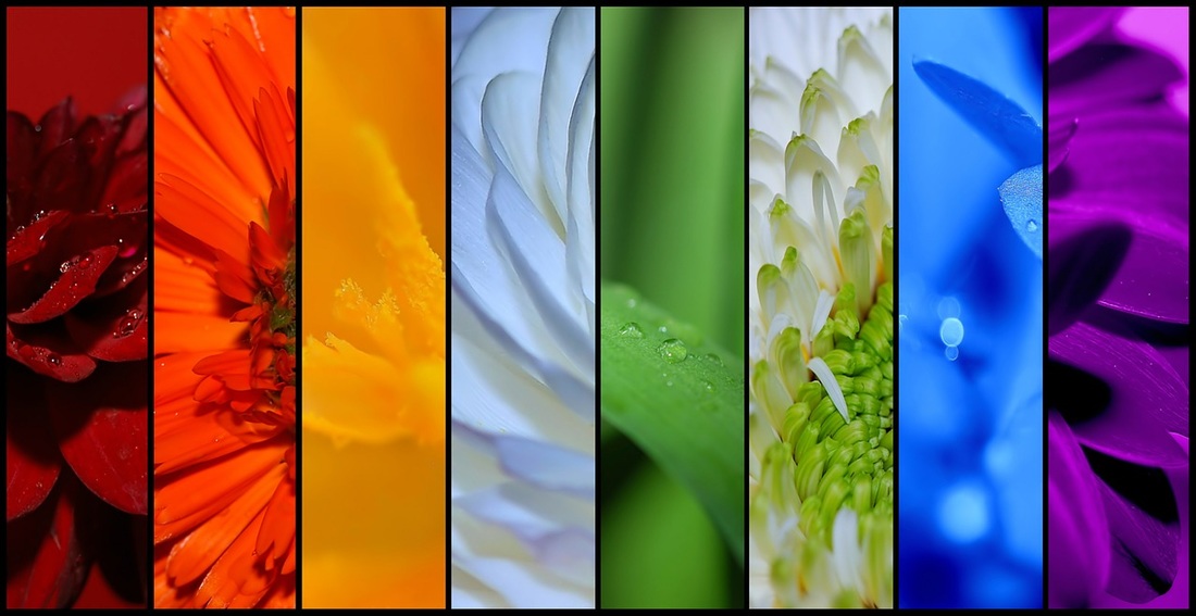
Every day we decide what color to wear, enhance our interior spaces with color, and often decide what to eat based on color. Incorporating specific colors into our landscapes often gets overlooked, but with just a few adjustments, you can create the perfect outdoor space for your desired mood and ambiance. There are many ways to incorporate color into the outdoors such as, outdoor furniture, planter pots, painted walls, garden architecture, art, and of course plants. Setting the mood: Red = excitement. Red is a dramatic color that helps to increase excitement and interest. If you are feeling tired and lethargic, a short time looking at red is a good solution to increase enthusiasm. Orange = energy. Orange is a dynamic color that creates a sudden burst of energy and stimulation. But beware…orange may also trigger a person to feel agitated. It seems that people either enjoy orange or they do not. Yellow = cheerfulness. Yellow is a cheerful, happy color that helps to brighten your day. Yellow is a good color to incorporate in locations with frequent cloud cover. Yellow is often the favorite color of children. Green = refreshing and cool. Green is in the center of the color spectrum and creates a feeling of peace and harmony. Green produces a cool, soothing setting and helps us feel rejuvenated. Blue = calm and peaceful. Blue helps to create a relaxing mood. Studies have shown that blue helps to reduce blood pressure and slows breathing. Blue is often used to create a tranquil environment for relaxation and reflection. Purple = motivating and healing. Because purple is a combination of red and blue it has attributes of excitement and peacefulness at the same time. I believe purple is the ultimate color for healing and inspiration. When designing healthcare gardens, my favorite color combinations are purples, blues and greens. Setting the Mood: Colors for Outdoor Spaces. Author: Susan Combs Bauer, Landscape Architect at BauerCombs & Associates, Inc. |
News & TipsBauerCombs News and Landscape Garden Design Tips with Susan. AuthorSusan Combs Bauer, Landscape Architect www.bauercombs.com 


Have a question? Send us a note and say hello, we'd love to hear from you!
|
 RSS Feed